Planning of the Tittle design for Final Task
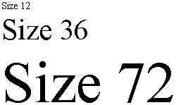
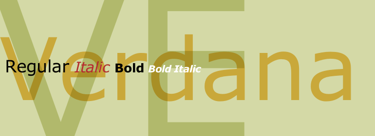
Hey everyone it's Natalie! and in today's blog specifically I will be discussing the planning of the tittle for my final task project. Now the font I will be planning on using due to the feel and genre of the movie will be Verdana, Times new roman and of course Helvetica. The color I will use will be a dark red much as a blood color and dark ocean blue.with dark features. The sizing of the text will vary throughout the scenes but most definitely will be being for it to be eligible to read by the audience and for dramatic effect as well. Most importantly I feel that while working on the title the one that I feel fits the best is " Moonlight". With that being said such tittles will fade into the film and will appear on specific objects on the set that have a meaning towards the film. Which then gives a much more in depth vision into the film and continues the sequences of the overall emotion. And when it comes to the prod of time they will be on screen I will say for the other tittles not including the film's tittle about 25 seconds. But, for the main film's tittle about 45 seconds and with the seconds of it fading away in the calculations. Well, thanks for reading see you guys soon with new updates!


Comments
Post a Comment